Trading System Selection
Once GSB has been run by clicking the play button, systems should appear after a few minutes. The GSB Manager will take about an additional 2 minutes to start its workers.
When its finished we find that GSB has developed a considerable number (Closed to what we decided) of trading system. We now need to find a trading system with good balanced performance over both the training and test data. You can click on the headings of each row in the window part of which is shown in FIG 1.61 to order/sort the systems for that particular parameter. What I have done with these systems is to order from highest to lowest P-F which is Pearson – Full Period by clicking on the P-F heading – indicated by the red arrow. This is the Pearson Coefficient which measures how close the full equity curve for both training and testing (in-sample and out-of-sample) periods is to a straight line (a straight line has a value of 1.0). The highest value in FIG 1.61 is 0.994 and there are a number at 0.991 and above in the limited number of system results shown 0.990.
We also looked at NP/DD-F which is Net Profit/Drawdown (Closed Trades) – Full Period. I then looked for a balance between total profit (NP-F), win percentage (%-F), number of trade (C-F), size of trade (AT-F) and profit factor (PF-F).
We looking for a reasonable number of trades over, say 200, and a trade size preferably over $100 with a win percentage around 60% plus and a profit factor close to 2.00. The top system shown and highlighted in the red box meets all of these requirements. However, the second system shown delivers a higher profit although with a lower win%, trade size and larger drawdown. (You can click on the column headings to see what each symbol means.) Let’s take a look at both systems.
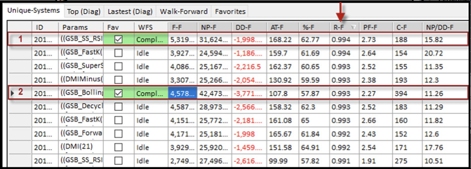
FIG 1.61 Performance Results and Selection
By scrolling the table to the right can check out the performance parameters on both the Training and Testing periods. You can see some performance data in training (red headings) and testing (green headings) in FIG 1.62. The easiest way to assess the robustness of a trading system is to look at the Equity Curve. This is shown in FIG 1.63 for the first selected AAPL system (system labelled 1 in FIG 1.61). The equity curve climbs steadily with quite small drawdowns over both training and testing.
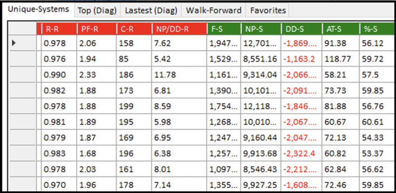

FIG 1.62 Performance in Training and Testing
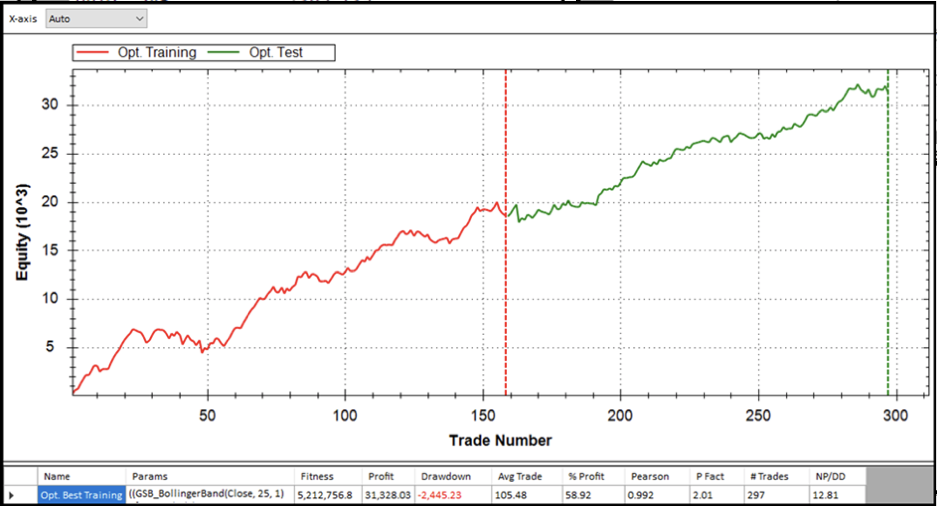
FIG 1.63 Equity Curve for System 1
The equity curve for system 1 shown in FIG 1.63 is quite linear and looks good on both in-sample and out-of-sample data (training and testing). The combined performance results show Net Profit at $31.6K, Drawdown at $2.0K, Trade Size at $168, Win% at 63%, Profit factor at 2.73 and No of Trades at 188. These are quite acceptable numbers.