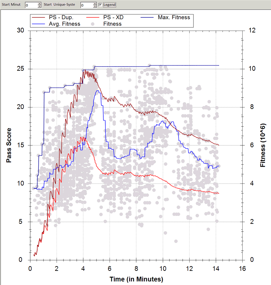
Reporting Graphs
The peak fitness is the top dark blue line. 
The bright blue line is the average fitness. 
Each dot is the fitness of every system built.
Brown is the amount of systems that pass the performance metrics. High is good. 
Red is the amount of systems excluding duplicates that pass the performance metrics. High is good. This is a inverse of the old C/US figure. 
You can see from the graph below that brown and red are diverging. This shows that increasing number of systems are rejected due to them being a duplicate system.
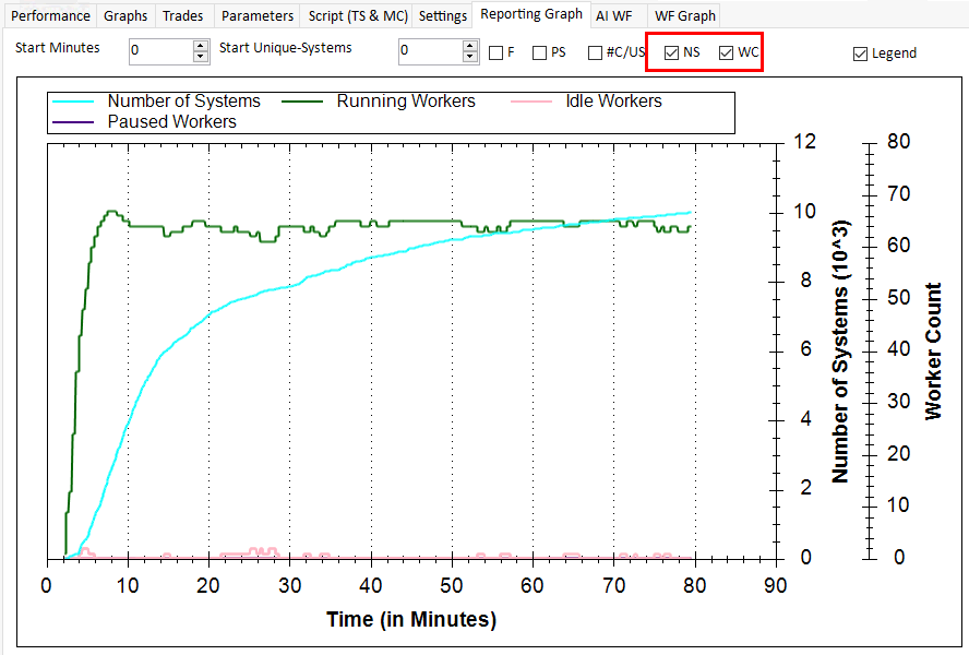
We now have additional reports, the number of workers and the number of systems.