Monte Carlo WF

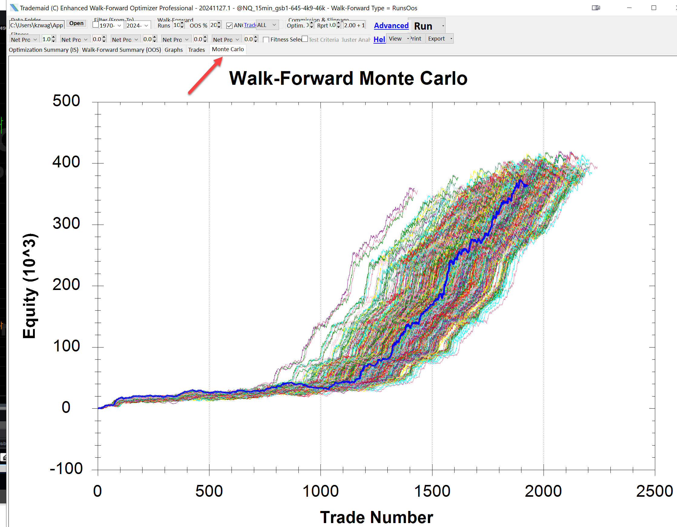
This shows a graph of all combinations of WF performed.
The graph is unusual and a superb example where most WF gave superior results to the final thick blue equity curve.
A poor MC WF would have more curves below the thick blue line.
In future builds we hope to have a metric that rates how good the curves are relative to the original curve.